Introduction
The ultimate test for any no-code tool is whether it helps people solve the kinds of problems usually solved by writing code, but without learning how to program. As toolmakers, we have to convince people that it’s worth their time to learn something new. We have to show how our tools can make them more efficient, empowering them to do things they couldn’t otherwise do.
There are two ways to empower users. We can “lower the floor,” making our tools more accessible and easy to use. Or, we can “raise the ceiling,” removing limitations on the kinds of problems our tools can solve. It's important to consider both of these directions.
Initially, though, it's more important to lower the floor. People are impatient, and their time is valuable. To convince people that a tool is worthwhile, it’s helpful to get them quickly to the point where they can solve a personal problem. One way to do this? Build a discoverable interface, which helps them learn by doing.
During my residency at Glide, I've tackled this problem of discoverability, looking at different ways Glide might become an environment that teaches users how to program just by using it.
Glide is already an approachable tool. To get started, users can just import an existing Google Sheet, and Glide will automatically generate a default app that users can modify. To create more complex behaviors (like calculating a value based on other columns), though, they’ll need to learn about computed columns —a feature that’s complex enough to prevent some beginners from building anything more than a basic app.
What Makes for Discoverability?
Before looking at some prototypes I put together, let’s explore some attributes of a discoverable interface.
Goal-orientation
When interacting with a tool like Glide, a user has a specific goal in mind. After formulating that goal, they try to figure out how to accomplish it with the “building materials” provided by the tool.
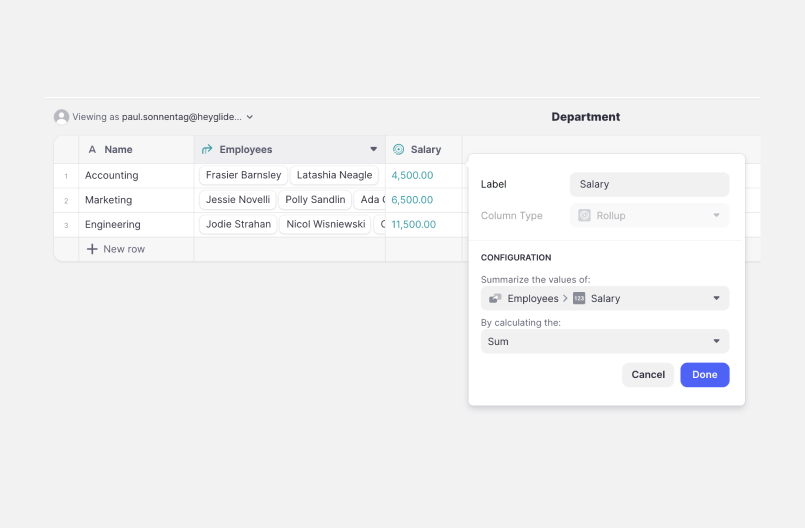
For example, consider how we might use Glide to calculate “total salary by department.” With a rollup column, we can specifying the attribute to summarize (Employees > Salary), and then how to summarize it (Sum).
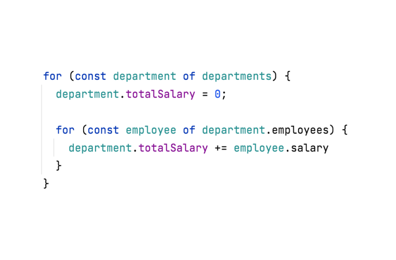
On the other hand, with a programming language like JavaScript, we’d have to think about various other concepts like iteration and variable names.
Physical closeness
Physical closeness is another trait that can help with discoverability. Can the user achieve their goal in a single place? Or, do they need to jump between different sections of the tool?
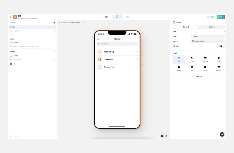
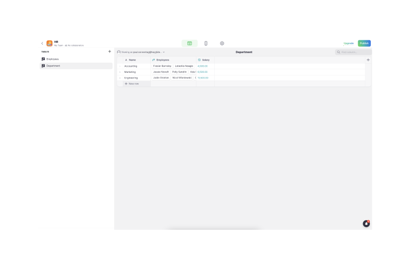
Glide’s interface is split between a designer (used to change the visual appearance of the app) and a data editor (used to modify underlying data and define computations). This division creates a clean separation of concerns.
However, many goals require users to work in both of these areas, changing their app’s visual appearance and its underlying data and calculations. For beginners, this may be prohibitively confusing.
Verb-Noun vs Noun-Verb order
I borrowed this concept from Amir Patel, who describes it in context of Ultima 6, a role-playing game.
In the initial implementation of the game, players would pick an action to perform (a verb), and then follow it with the object (a noun) to which they’d like to apply that verb. However, usability tests showed that reversing this order made the game’s controls more accessible. If the user first selects an object, the game can show actions that are relevant to it (and omit all others).
Glide uses verb-noun order. When creating a computed column, users first select a type of computation (a verb). Then, when configuring that column, they can choose its input (a noun). This means that users have to know what kinds of computed columns are available in Glide, and what they do. For example, in the "total salary by department" example (above), they’d have to know to use a rollup column. And, of course, they may not know that.
On the other hand, if we let the user pick the input column first (in this case, the salary), we can then give them a list of relevant computations they might want to perform.
Natural language
Programming with natural language has been a longtime dream. Unfortunately, I think we're still far away from an environment that lets you talk to the computer to tell it, directly, what you want to do.
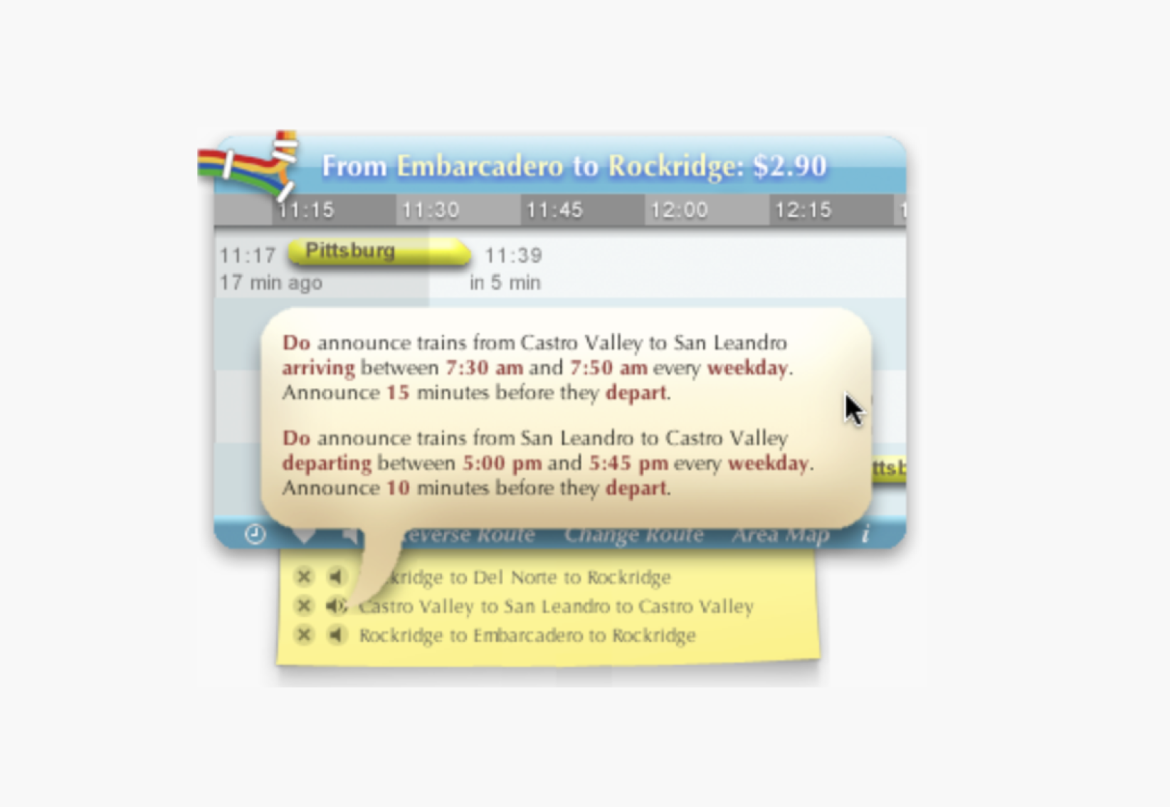
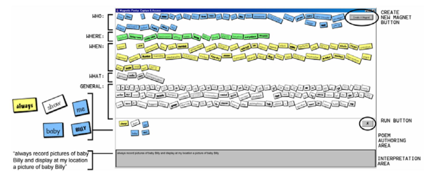
But, natural language doesn’t have to be an all-or-nothing deal (an interface that accepts free-form text, or nothing at all). There are more constrained ways to use natural language in a programming interface. These approaches may not be as powerful, but they’re more realistic to implement. For example:
Areas of focus for my prototypes
With the above ideas in mind, I decided to focus on a few key concepts as I started prototyping different ways to improve the discoverability of Glide’s interface.
Navigation instead of construction
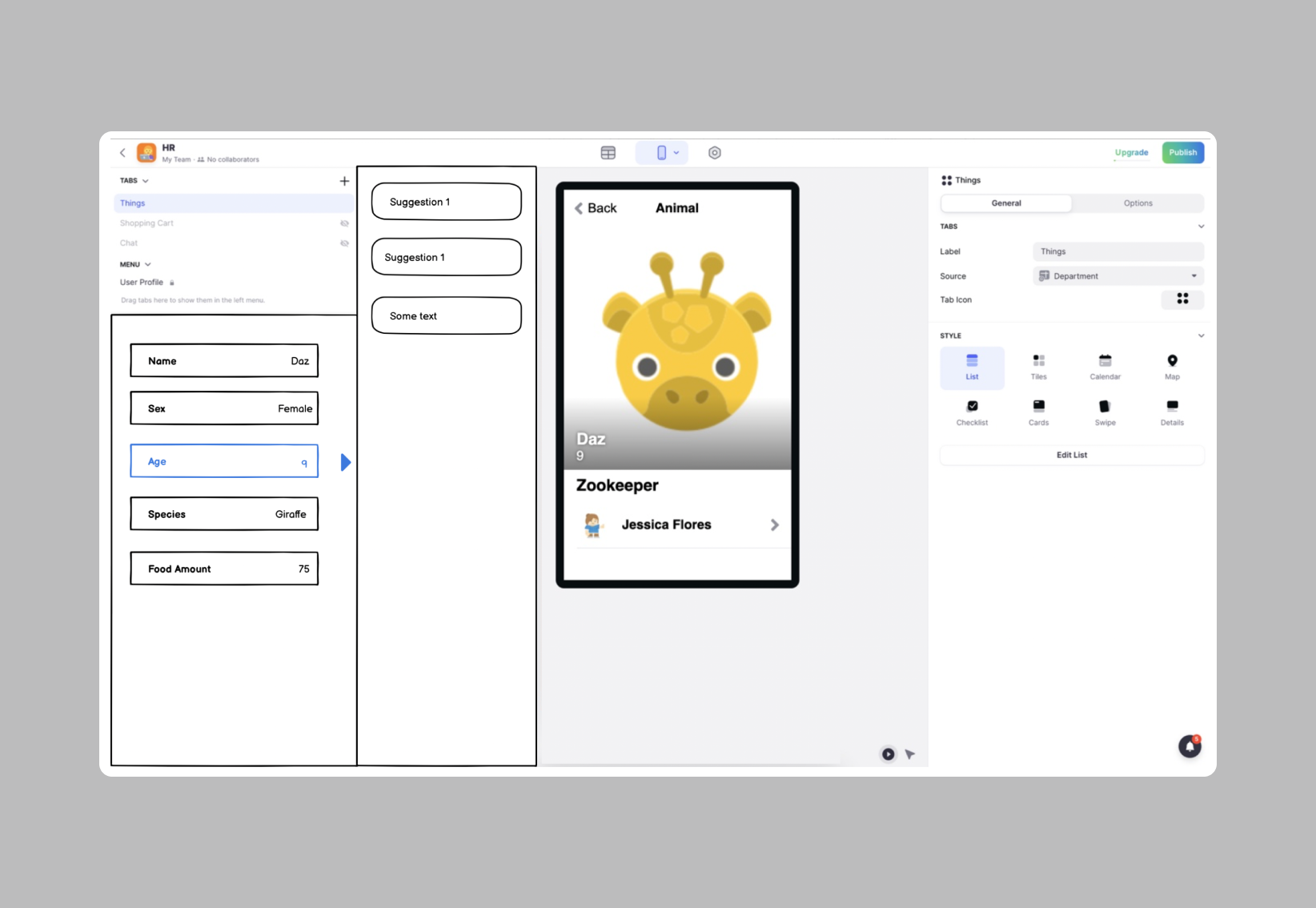
First, I wanted to minimize the number of concepts users needed to know to be productive in Glide. Users should be able to create new computations by browsing their data and asking the tool for suggestions relevant to the data they’re looking at.
This inverts the Glide’s current verb-noun order. My prototypes focus first on the data (the noun), and second on a suggested list of things that can be done (the verb) to that noun.
In my prototypes, these “verb suggestions” are based on data selected by the user, so they can be quite close to the user’s actual goal (not just a generic list of common, high-level operations). In simple cases, there may be a suggestion that’s an exact match for the user’s goal.
Some suggestions represent a combination of operations, too. Of course, it’s not possible for the interface to display all possible combinations, and in cases where the user’s exact goal isn’t specifically suggested, they can choose something close and adapt it.
With this design, we can also remove the physical separation between the designer and the data editor. We can add a data panel to the left side of the designer, showing data from the current page. When a user selects a piece of information we can suggest computations.
Statement Templates
I also wanted my prototypes to leverage peoples’ innate understanding of language.
Today, many no-code tools (including Glide) use form-based programming. With this approach, forms are used to specify configuration options (as they are, for example, with Glide’s rollup columns). This is a familiar approach, but it can take up a lot of space. And that means that complex forms with many options are hard to grasp at a glance.
Inspired by Bret Victor’s sentence-based configuration, which expresses configuration as natural language statements with highlighted words for users to swap out as needed, I decided to use natural language to present Glide’s computations.
In the prototypes, statement templates are attached to their results. For example, here’s a suggested statement for a list of animals:
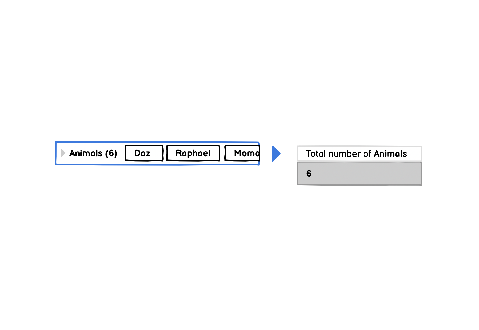
This list can be expanded to show animal attributes, and suggested computations for each. For an animal’s food amount, suggestions might look like this:
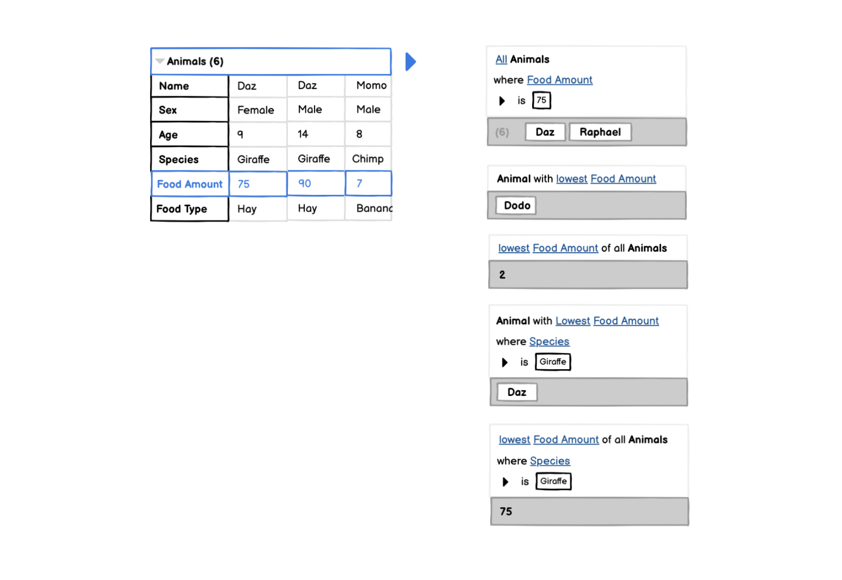
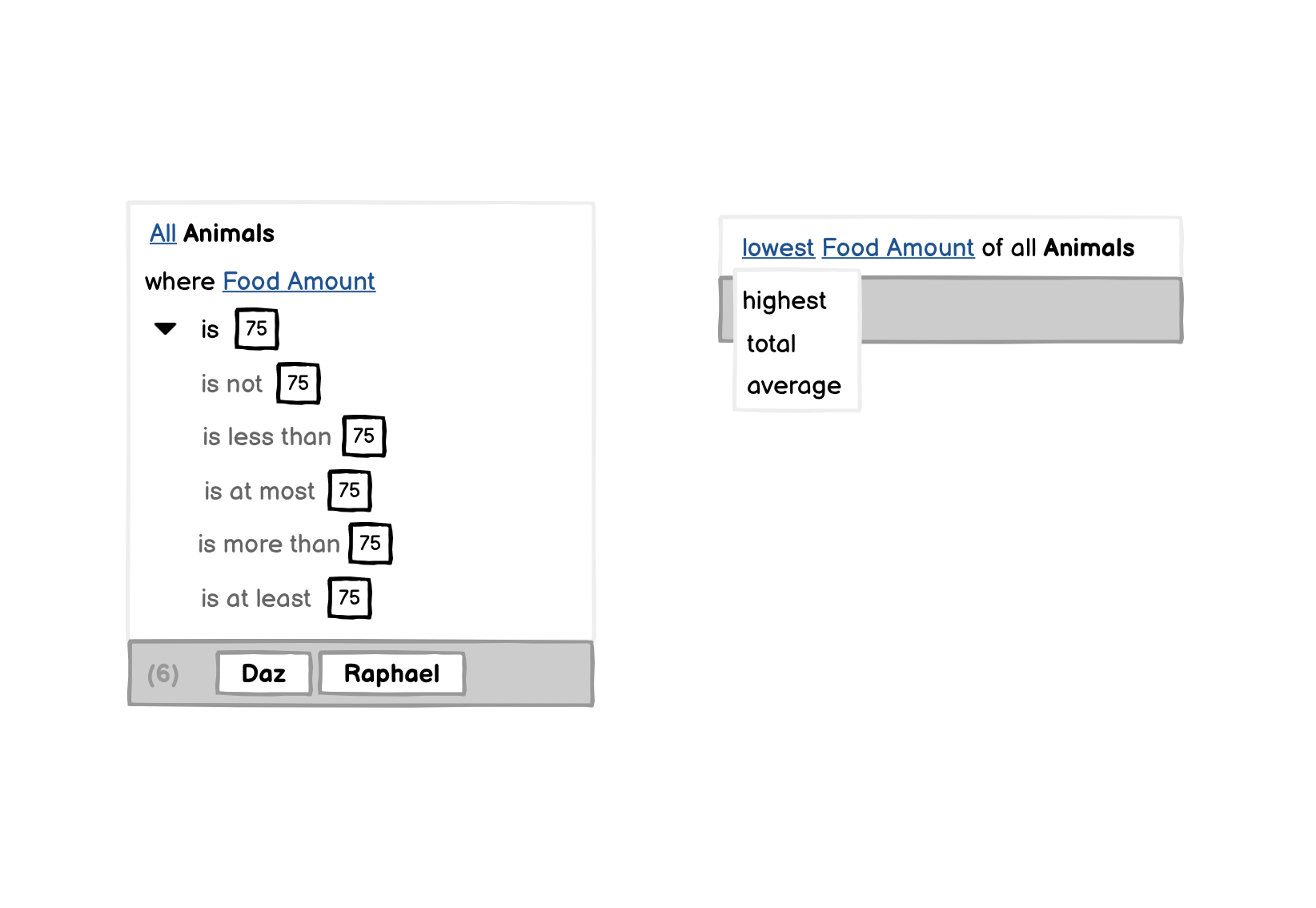
To adapt the suggested computations, users can swap out underlined words and expand alternative conditions:
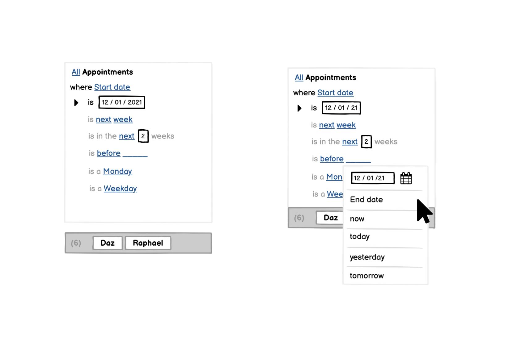
With template statements, we can also use different vocabularies for different kinds of data. For example, for dates:
Prototypes
In this section, I want to discuss how my thinking evolved through three prototype iterations.
But, before I talk about the individual iterations, I want to stress how crucial it was to do usability tests to evaluate each iteration. I'm often too concerned with the power of the tools I design, asking myself whether they’re powerful enough and what they can (and can’t) do.
These are valid questions, but they’re secondary to a more primary concern: can people understand the interface? If the answer is no, it doesn't matter how powerful it is. To validate a design, frequent user tests are essential.
I tested each iteration of my prototype with two or three users. A small number like this is not representative, but at this stage I care more about getting qualitative feedback, since whether the general idea works or not is usually apparent after testing with a few users. This is especially true if an ideadoesn’t work.
Steve Krug wrote an excellent book on how anyone can introduce user tests into their organization: Rocket Surgery Made Easy
First Prototype
n the first prototype, here’s how you’d compute the total amount of hay required for all animals in a zoo:
Finding suggestions
With this prototype, most people could create simple computations (for example, the total number of animals). But, they struggled when trying to add complex computations that required word swapping. For example, here are the steps necessary to calculate the total hay for all animals:
- Select the animal's Food amount, and look at the suggested computations.
- Find the suggestion for Lowest food amount of all animals where name is equal to Daz.
- Swap Lowest with Total.
- Swap Name with Food type.
Most people didn't get further than the first step, because they didn't realize they could pick a statement similar to the computation they wanted, and then modify it by swapping out words. Instead, they were looking for suggestions that matched their exact goal. For example, one tester explained that they had specific words in mind—"total" and "sum"—and they were looking for a suggestion with one of those words.
The statement templates in this prototype have another drawback, too: repetition. If we show an exhaustive list of suggestions, some fragments of text will be repeated in multiple statements. To reduce the total number of statements shown, we might try to combine their conditional and unconditional forms (and provide an option to add conditions). But that would require more interaction, which conflicts with the "scanning" strategy that most people use.
Following standard natural language conventions
So far, we’ve been looking at list computations like aggregations and filters. To match Glide’s current functionality, our prototype also needs to support computations with primitive values like text and numbers.
For example, consider Glide’s Math column, which allows users to calculate a value based on other columns:
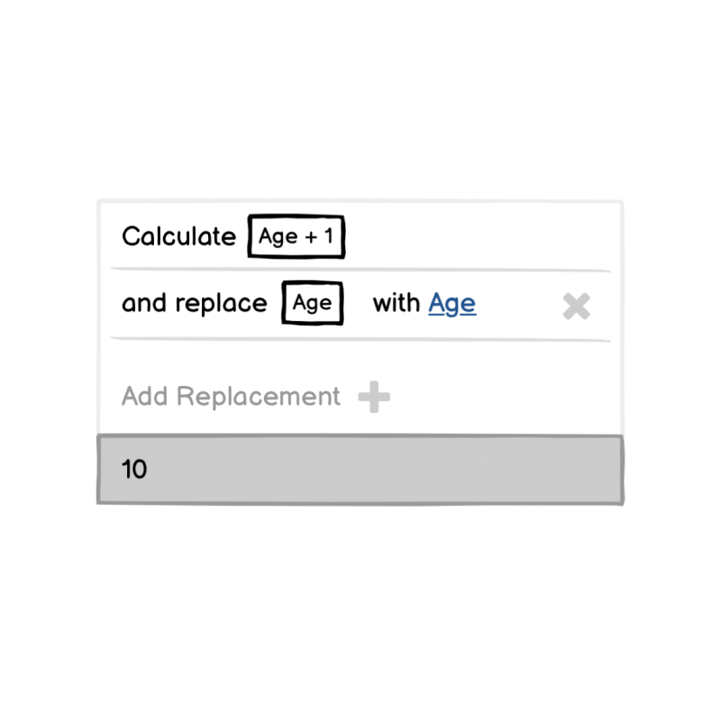
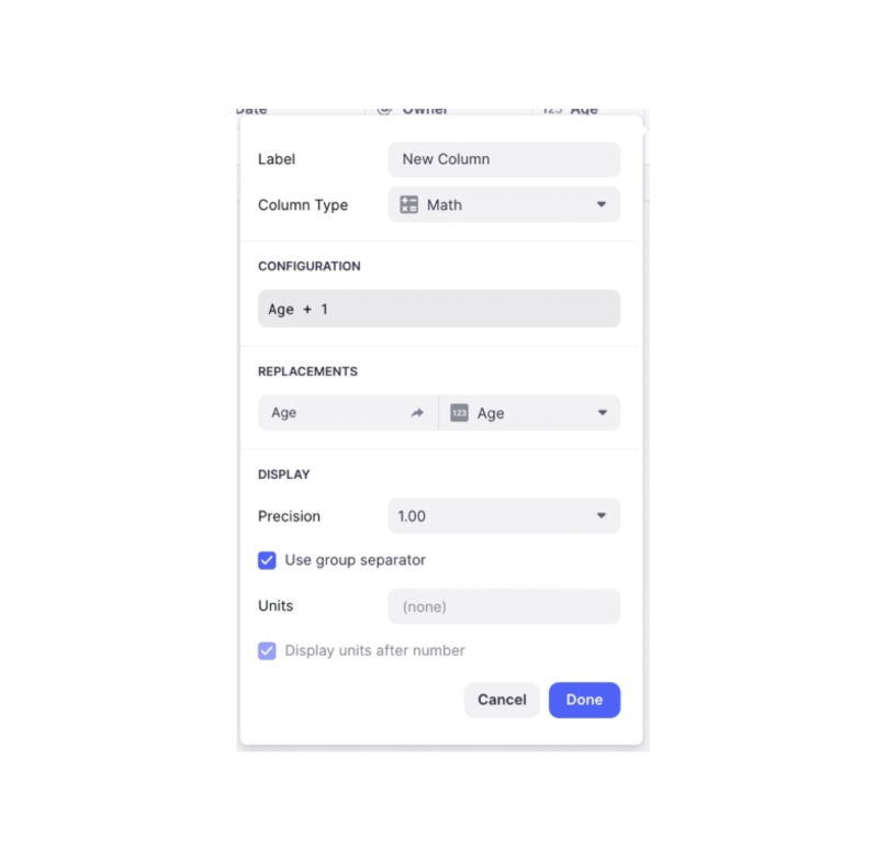
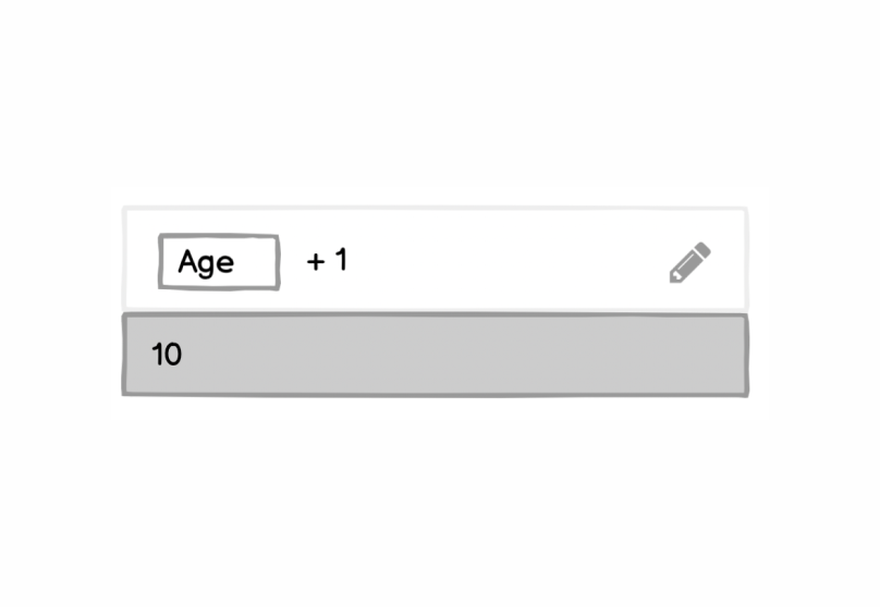
In the end, I went with a much simpler design and just represented the formula very literally:
Second prototype
In the second prototype, I tried to address some of the initial prototype's issues and extend its capabilities. For comparison, here’s how to use the second prototype to calculate the total amount of hay required for all animals (the same example from above):
Data explorer and suggestion changes
The two most significant changes here are the display of lists in the data explorer and the presentation of the suggestions. There are now only two suggested statements:
- One with all items in the list
- Another that has a filter condition
Aggregations are grouped under these two statements. Because the aggregations are just labeled values, there is enough space to display them all at once.
In the first prototype, the data panel displayed lists as a table, which meant that only primitive attributes of the list items were visible (for example, in the list view, users couldn't see that the animals have a relationship to the building where they’re housed).
To make it possible explore nested relations in lists, the data explorer in this prototype shows attributes of a single list entry (the user can pick which one). This makes it possible to filter list entries on nested attributes.
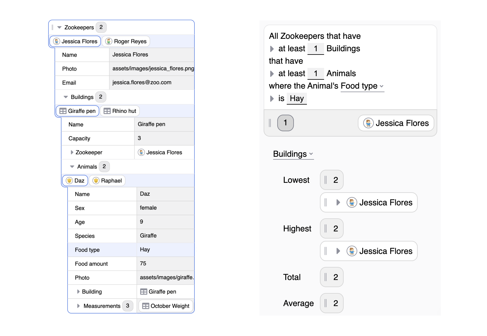
For example, you might select a given zookeeper (Jessica Flores), and then one of their buildings (Giraffe pen), and then an animal in that building (Daz), and then that animal’s food type (Hay) and get the following suggestions:
Grouped computations
In the second prototype, I also added the ability to do grouped computations, adding grouping as another type of aggregation.
When the user adds a group aggregation to their app, it’s displayed as a grouped list. Then, the properties panel can customize how a group is displayed and add per-group aggregations.
For example, here’s how to get the total food amount for all animals, grouped by food type:
General usability issues
This prototype design still has some issues. For example, some people couldn’t figure out the more complex tasks I gave them, like calculating the current weight of an animal by selecting its most recent weight measurement.
Also, some people still had trouble understanding the structure of the suggestions. This version of the prototype is more structured and easier to scan, but not all testers understood that aggregations belong to the statements that come immediately before them. above.
Flexible order of concepts
After this round of usability tests, I had an important realization. My original goal was for users to navigate from their data to the computations they had in mind. I didn't realize, though, that in some cases I was enforcing a specific order.
For example, the concept "most recent weight of an animal" relates to two attributes: the date of the measurement, and the weight of the measurement. Looking at the suggestions for the date field, a user can expand the "most recent date" aggregation and grab the associated weight. On the other hand, there’s no way to start with “weight” and get to “most recent.”
This forced order clashes with the way that natural language works. While English grammar defines a specific order for the words in a sentence, it's possible to change that order by rephrasing the statement. For example:
- the weight of the most recent measurement
- the most recent measurements' weight
It would be interesting to further investigate how a user’s mental model affects the way they order concepts. But, it’s clear to me that the interface should not enforce a fixed order. People should be able to find the right computation by selecting the relevant pieces of information in any order.
Third prototype
My third prototype evolves the suggestion grouping idea from the previous version. In this version, rather than using unfiltered and filtered categories, each type of computation has its own group.
Here’s an example that shows how to use this prototype to compute the most recent weight of an animal (in two ways: starting from the date, and starting from the weight):
To avoid overwhelming the user when they first open the suggestion panel, the groups are collapsed by default. Expanding a group is like saying, “I want to use the top-level suggestion, but I also want to modify it a bit.”
Grouped computations work more naturally in this model, too. In the previous prototype, there was only one level of aggregations—so the user had to drag a grouped list onto the app and then specify the aggregation, per group, in the properties panel.
I haven't implemented a filter operation in this prototype yet, but it would be easy to add. Furthermore, we could extend this expandable computation approach to allow users to drill down multiple levels. They could first pick a filter, then an aggregation, and finally a grouping.
Conclusion
During my residency at Glide, I tried to explore new directions for the platform. The exploration has been guided by a feedback cycle between building prototypes and validating them in small usability tests with two or three test users. I don't have definitive answers, but I've uncovered some interesting directions that can be used as starting points for new developments in Glide. I’ll summarize them here.
Providing people with a structure they can explore, like the data panel in the prototype, is an excellent way to introduce computations. People liked that they could drill down into the data and see how things were related, and there’s a smooth transition from browsing data to creating computations by prompting suggestions.
This mode of browsing also encourages the exploration of alternatives. Suggested computations in the panel are temporary, and the user can tweak and expand them to see what they can do with their data. If they aren’t happy with the result, they can pick another suggestion.
Also, it’s much easier to navigate an existing data structure and view suggested computations for it than it is to imagine how to combine multiple operations to get a desired result.
Related to exploring suggestions, there are two topics I didn't have time to explore. Currently, the computation suggestions don't allow complex conditions like the conjunction or disjunction of sub-conditions. It would be possible to extend the prototype with a straightforward option to combine multiple conditions with "and" and "or". But, I think it’s worth exploring, in its own right, how to design an understandable interface for creating complex conditions.
The data panel isn't the only place where Glide might suggest computations. The properties panel could be used for this, too (I touched on this topic briefly when adding grouped lists in the second prototype). Computation suggestions in the properties panel could work as a complement to the data panel.
Another theme of my residency has been using natural language to represent computations as human-readable statements. Initially, I had a fixed form where each computation suggestion was an individual statement. Over time, I deviated from this fixed form to fit more suggestions on a single screen, and to make it easier to scan them. I still think the statements are a valuable way to represent individual computations (for example, when the user inspects a UI component in the properties panel). But they aren’t space-efficient when showing many variations of similar statements.
Another lesson I learned is that it's easy to take the superficial form of a concept like natural language without paying close attention to the assumptions people make about it. I first encountered this expectation mismatch when translating Glide's Math column into a statement template. Another expectation created by natural language is that concepts don’t have a fixed order, and my prototypes don’t fully account for this.
It would be interesting to explore how to combine statement suggestions with text search. For beginners, the search could be an alternative way to find computations. For experts familiar with the list of available computations, it could be a shortcut to create them quickly.
Use Cases
Connect
